Charts Overview
A comprehensive charting library for Vue 3, built on ECharts with MeldUI theming and dark mode support.
Overview
@meldui/charts-vue provides 9 chart components that integrate seamlessly with MeldUI’s design system. Charts automatically read your Tailwind CSS theme variables and support dark mode out of the box.
Available Chart Types
Charts 9
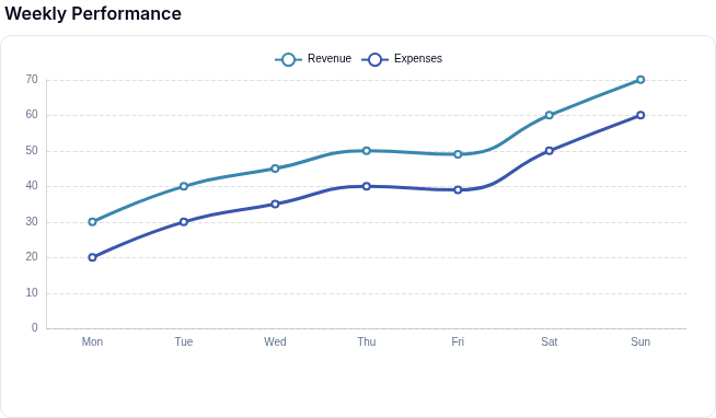
Display trends and continuous data with line and step interpolation.
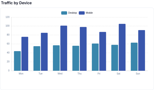
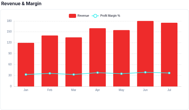
Compare values across categories with vertical, horizontal, and stacked bars.
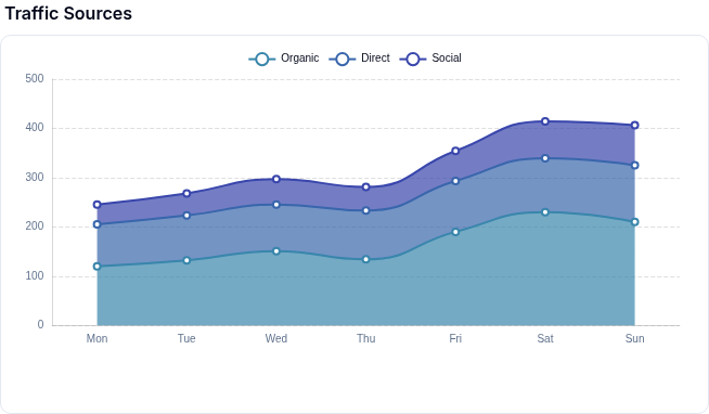
Visualize volume and cumulative data with filled areas beneath lines.
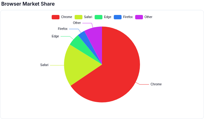
Show proportions of a whole with a circular chart.
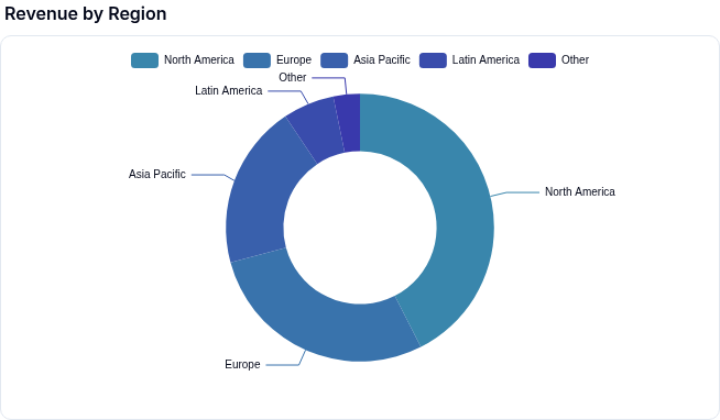
A pie chart with a hollow center, ideal for displaying a summary metric.
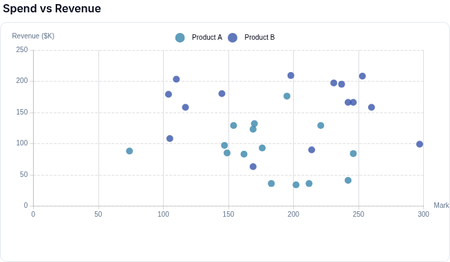
Plot correlations between two numeric variables.
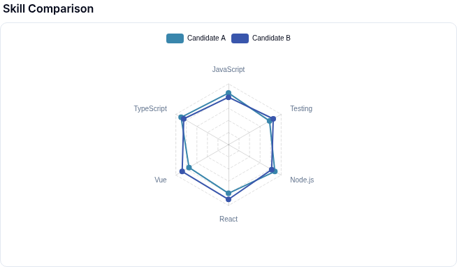
Compare multiple dimensions on a radial grid.
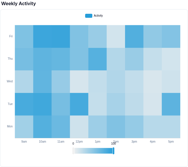
Visualize density and intensity across two categorical or numeric dimensions.
Combine multiple chart types (line, bar, area) in a single visualization.
No components match your filter.
Component reference
| Chart | Component | Best For |
|---|---|---|
| Line Chart | MeldLineChart | Trends over time, continuous data |
| Bar Chart | MeldBarChart | Comparisons across categories |
| Area Chart | MeldAreaChart | Volume and cumulative values over time |
| Pie Chart | MeldPieChart | Proportions of a whole |
| Donut Chart | MeldDonutChart | Proportions with a center metric |
| Scatter Chart | MeldScatterChart | Correlations between two variables |
| Radar Chart | MeldRadarChart | Multi-dimensional comparisons |
| Heatmap Chart | MeldHeatmapChart | Density and intensity across two dimensions |
| Mixed Chart | MeldMixedChart | Combining multiple chart types |
Installation
pnpm add @meldui/charts-vueSee the Installation page for full setup instructions.
Common Props
All chart components accept these shared props:
| Prop | Type | Default | Description |
|---|---|---|---|
config | object | required | Chart-specific configuration object |
height | string | '350px' | CSS height of the chart container |
width | string | '100%' | CSS width of the chart container |
title | string | - | Chart title displayed above the chart |
loading | boolean | false | Show a loading spinner overlay |
ariaLabel | string | - | Accessible label for screen readers |
Color Palettes
Charts support named color palettes via the colors config property. Pass a palette name string or a custom array of hex colors.
| Palette | Description |
|---|---|
default | Balanced palette suitable for most use cases |
vibrant | High-saturation colors for emphasis |
pastel | Soft, muted tones for lighter designs |
monochrome | Shades of a single hue |
earth | Warm, natural tones (browns, greens, ambers) |
ocean | Cool blues and teals |
sunset | Warm gradient from orange to purple |
corporate | Professional, subdued palette for business dashboards |
neon | Bright, electric colors for dark backgrounds |
accessible | High-contrast palette optimized for color blindness |
Additional Resources
- Theme Customization — dark mode, CSS variables, custom colors
- Chart Events — click, hover, and selection event handling