Components
Every @meldui/vue component at a glance, grouped by type. Browse the full set and jump straight to any component's documentation.
@meldui/vue ships base UI components (built on shadcn-vue) plus MeldUI-original
composites. Use the filter to find a component by name, or browse by category below.
Interactive 7
Displays a button or a component that looks like a button.

Groups multiple buttons together with consistent spacing and visual connection.

A two-state button that can be either on or off.

A set of two-state buttons that can be toggled on or off, supporting single or multiple selection.

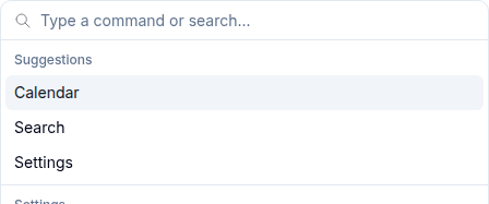
A command palette for searching and executing actions, similar to Cmd+K interfaces.
A carousel component for cycling through elements with navigation controls.

An autocomplete input with a filterable dropdown list for selecting values.

Form 17
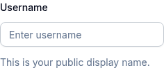
A text input field for capturing user input.

A multi-line text input with optional auto-sizing support.

A custom select component with keyboard navigation and grouping support.

A control that allows the user to toggle between checked and unchecked states.

A set of radio buttons where only one can be selected at a time.
A toggle switch control for boolean values with color variants.

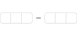
A range slider for selecting numeric values with color variants.

A numeric input with increment and decrement buttons.

An accessible label associated with form controls.

A form field layout component with label, content, description, and error display.
Form components with vee-validate integration for validation and error handling.

A styled native HTML select element.

Groups an input with addons, buttons, and text elements.

A one-time password input with individual character slots.
A PIN code input with individual boxes for each character.

An input for managing multiple tags or keywords.

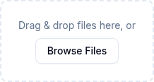
A file upload component with drag and drop, previews, and progress tracking.
Layout 9
A vertically stacked set of interactive headings that reveal or hide sections of content.
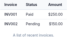
A semantic HTML table with consistent styling for displaying tabular data.
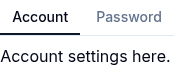
Tabbed navigation with line and pill variants for organizing content.
A visual divider between content sections.

A custom scrollable area with styled scrollbars.
Resizable panel groups with draggable handles for flexible layouts.
Displays content within a desired aspect ratio.

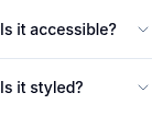
An interactive component that expands and collapses content.

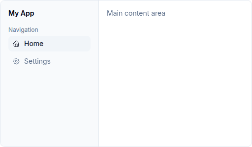
A collapsible sidebar navigation with nested menus, sections, and responsive behavior.
Navigation 7
Navigation breadcrumbs showing the current page location in a hierarchy.

A menu that appears on trigger click with items, groups, checkboxes, and nested sub-menus.

A right-click context menu with items, groups, and sub-menus.

A horizontal menu bar with dropdown menus, similar to desktop application menus.

A complex navigation menu with rich content areas, suitable for site-wide navigation.

Navigation controls for paginated content — page numbers, prev/next, and first/last.

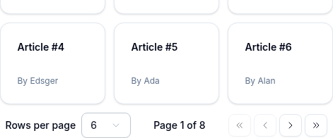
Pagination toolbar for tables and lists — prev/next, page-size selector, and page info.
Overlay 7
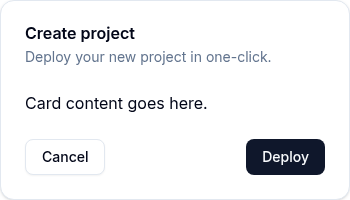
A modal dialog that overlays content and requires user interaction.

A modal confirmation dialog that interrupts the user for important decisions.

A panel that slides in from the edge of the screen.

A touch-friendly drawer component that slides from the bottom of the screen.

A floating content panel that appears on trigger click.

A popup that displays information when hovering over an element.

A rich content card that appears when hovering over a trigger element.

Data Display 6
A container for grouping related content with header, body, and footer sections.
An image element with a fallback for representing the user.
A small label for status indicators, categories, or counts.
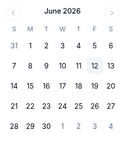
A date picker calendar for selecting individual dates.
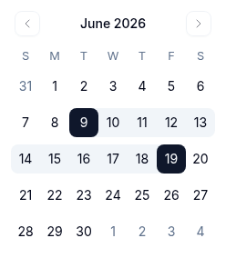
A calendar for selecting date ranges with start and end dates.
Displays keyboard key indicators for shortcuts and key combinations.

Feedback 10
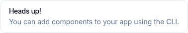
Displays a callout message for important information with color variants.
A horizontal progress bar indicating completion status.

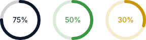
A circular progress indicator with customizable size, thickness, and color variants.
A placeholder loading animation for content that is still loading.

An animated loading spinner indicator.

A small status indicator dot with color variants and animation effects.

An empty state placeholder for when there is no content to display.

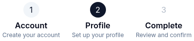
A step-by-step progress indicator for multi-step workflows.
Toast notification system for success, error, and informational messages.

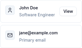
A flexible list item component for displaying structured content with media, text, and actions.
Composites 10
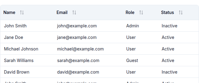
A data table with sorting, filtering, pagination, selection, pinning, and server-side ops.
A composite date picker with presets, calendar, and support for single or range date selection.

A Vue composite for viewing and annotating PDF, image, text, and markdown documents.
A searchable multi-select dropdown with badge display, groups, and creatable options.

A rich-text input with @-mention suggestions, customizable triggers, and serialization.

A filter toolbar with chip-based filters (8 types), debounced search, reset, and v-model.
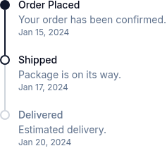
A vertical or horizontal timeline for displaying chronological events.
Displays a stack of avatars with an overflow indicator.
A component for copying text to the clipboard with visual feedback.

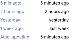
Displays a human-readable relative timestamp that updates automatically.
No components match your filter.